Thursday, January 25, 2024

Front Cover Page development

 I will put my progress for my magazine front cover here


This is the layout, and the rough sketch

Masthead: Divine Feminine

Genre: Fashion and lifestyle


Rough sketch


Pictures and Layout


For the first layout im gonna be using this picture, the model is me myself and i took this photo using tripod and digital camera with timer. I like the idea of the model looking straight into the camera, as it engage with audience and make them more intrigued to look at the magazine, it also so colorful and not monotonous as it has so many bright colours in it. 

The placement of the model right in the middle and the plain grass background make it easier to put coverlines on the side of the model, and im planning to put it following the curve of the body to make it appealing.

Here's the layout


( - ) : -The font can't be seen clearly
- Too many coverlines
-The coverlines on upper right are too long


improvement: - I changed the font so it can be seen clearly now
- Deleted one coverlines so it balanced, 2 on the right and 2 on the other side
- I shorten the coverlines on the upper right and make it shorter.
- I changed some of the font on the coverlines to make it more appealing by highlighting some words.
- Added barcode


Improvement: - I added an element next to the masthead to make it more appealing and not to plain


Improvement: - I added some colour, pink and white and purple to the coverlines text to make it cuter and match the colour tone, as the model has the same dress colour.
- I added the price of the magazine 
- I added the number of issue of the magazine.


Picture and layout 2


This is my picture for layout two, with 2 models. i took this picture with tripod. 
What i like from this picture is, both model look at the camera which it engage more with audience and drawing attention from the audience, also like the soft colour pallete as it matches the theme. And i like the space for the masthead which is i can put a big and large masthead, unlike the previous one, there's not much space for the masthead.

What i dislike about this picture is, because there is two model, so that means there's not much space for coverlines which that means im gonna have to delete some of the coverlines, and since its two model cover pic, its not really drawing attention because audience can't really focus on one object in the cover.

Here's the example of the layout


Here is my experiment with the font for masthead and coverlines


This is my first try, i try to use this feminine font, with coverlines and i try to make it colourful so its not boring and colourful colour make it more appealing for the audience.

( - ) = I got feedback from my teacher and he said that he cant really read the masthead clearly because of the font.
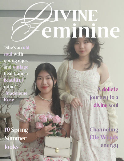


Improvement: So after receiving feedback from my teacher about the masthead that he can't see clearly, i decided to change the font into something that more simple.


Improvement : I also added an angel element just like the previous one, i think its unique and cute, and this can be my magazine signature or unique selling point


Improvement: I also added barcode and the magazine price.


Layout  
and picture 3


Here is the picture 3 for the front cover page, In this picture, both model stand up together closely and look at the camera to engage with audience, and what i like from this picture is that although i have more than one object i can still have space for my coverlines. And what i dislike from this picture is that i can't put the coverlines following the curve of the object like the first layout which i think is cool, so in this picture i can only put the coverlines covering the object.


Here is the rough sketch of the layout


I changed the picture of the front cover using the same layout of masthead and coverlines like the previous one.

As we can see, the colour of the coverlines doesn't match with the front cover colour theme, we can't even see it clearly.
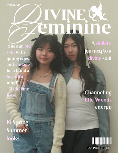


Improvement: I changed the colour of the coverlines so it can match the theme of the front cover better, i also use position guide so the layout can be more neat.  I also added barcode, an angel element which i wanna use as a signature for my magazine.

What i like from this cover is, i can put more object for the front cover page but i still have space to put my coverlines, because the model stand closely together with their mathing outfit makes it even more good and pleasant to look at.


So far i love all three covers, but comparing them all, i like the first one the most because its so colourful and i think it will caught audience's attention as it has a strong bright green colour and one object only, so i think it will have more potential to make audience be more interested. Other than that, i can put more coverlines and i can put it following the curve of the model, make it even prettier.


And since i already decide which one to use, im gonna focus on the first one.


I got feedback from my teacher to smaller the gap between every letter so it will look more better


I also add colour to the masthead, i take m y teacher's advice, and i decided to put the color pink to the feminine masthead, as pink is suitable for the word feminine.


So here is the final result of the front cover page, i changed the issue number and the date of the magazine after i thought that the issue number is a lot of number. And i also lessen the gap between every word in the coverlines so it will be more organized, i also enhance the quality of the picture so it will be more high quality.


Self reflection:

I find it really hard and stressful as i need to do a lot of research for the magazine. But my teacher helped me a lot throughout the making of the magazine because i ask him a lot such as how to arrange the layout of the magazine and how i have to make sure that the size of the font that im using have to be the same. And how i should be using border everytime to make sure that the content of the magazine will not be messy and arranged in order to make the audience not confused while reading through it. Additionally, i had a technical issue with flipsnack, the web that my teacher recommended me to use, in fact i can't use the web because they only provide four page only so it cut the half of my magazine, and its really hard to find another free flipbook website on the internet, but i managed to find one. And i think the front page was also the hardest one to make because i did a lot of research and i experimenting a lot for the front cover page.


Wednesday, January 24, 2024

Double page spread

 Im gonna put all the research and development for my double page spread here


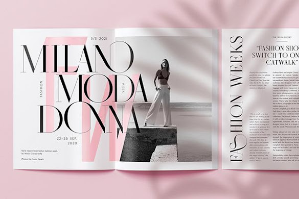
Here's the research for double page article that i took from pinterest and google


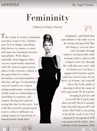
I think this one is quite simple, and i like the quotes, but i feel like its so boring as it has so many blank space.


This one is not double page but i like the way the put the model in the middle of the text. So it doesnt seem monotonous and not boring, i was thinking to put a model in the middle of the text coloumn also.

I think this one is cute as it has the own colour pallete, pink, but i can't really put the article here because its quite simple and if i use this kind of layout for my double page, i can't put all of my article because my article is quite long.


I like the way they put the signature sign above the title of the article, it looks interesting.


This one is quite interesting because the layout is unique and i like the layout for the font, but unfortunately its not suitable for me to put my article, i think it will be more suitable for picture there.


I think this one is quite interesting as they put the model right next to the article, but its still not the best layout for me. However, i consider using the repetition of the font as it fade.


I think this one has too many object and it kind of make me confused while looking at it, but the thing that i like from this double page spread, is that the way they put the object like that is quite interesting, i was planning to put the object like that in my magazine also.


I really like this one as it has a really soft colour, and although there's so many object, it doesnt 
make me confused, i think this one is i like the most, and the most suitable for my magazine.
So i was thinking to using the picture like that, without removing the background.


Here is my experiment working on the double page:


So i founfd this online article and i really like the layout, its very simple, its pink and it has the text all over.
So here it my very first experiment, i use a very soft pink background, i also use the matching font.


I input the actual title of my article, and i also remove the background of the mirror picture, it feels empty somehow.


 Because it feels empty, i decided to put some picture on it, but because the outfit and the theme is different so i decided to remove it instead.


I added the frame in the corner of the page, i also added some effect on it, because my teacher told me to experiment more on the font colour so i do some experiment on the font colour and decided to use different tone of brown for the article headings.


I tried to add the picture again but because it doesnt match the theme because everything goes along with each other but the one picture that i just added has different theme and different outfit so its kind of not match with the overall theme. But i like the picture.


So i decided to add the matching picture in the bottom corner but somehow because this is double page, its not balanced between one page and another page, because the left page has more picture and the other one is blank and more empty, i need to balance both of it.


I added the subheading on the upper right but because on the other side, the text are also on the upper left, i feel like it need to be more balanced.


So i put the subheading text near the picture, so it can draw attention also to the picture below. And make the magazine overall look more balanced from each page.


I got feedback from my teacher to make sure that the font size and the font gap are all the same so it can be balanced, so here is the result after i make all the font the same.

After doing some further research, i decided to put a quote and put the name of the photographer, and the page number also.


 Here is the result after i add the number page, the authors name, and the photographer's name.

Self reflection: 

I think making the double page spread is the easiest among all the magazine content, because it provides wider canvas for me to express my creation. However i still need to pay attention to every small detail on my magazine as sometimes i forgot because its not visible, until i asked my teacher for his feedback and he told me to fix all the arrangement which i think that such a hassle because im gonna need to change the arrangement of my article again. But overall for me its easier to make the double page spread in this form where it provides two page rather than doing it separately. Where after finished i use free pdf splitter on internet to split the double page into two.


Contents page

 I will put the progress and development for my contents page here


So here is my research for contents page that i took from pinterest and google

I like the layout of this one but the content of my magazine is not really much so maybe if i use this layout i will need to put some image again so it will not be really blank.


I like the way they put the contents, on the left side which is a good layout. Im considering putting the word like that also.


I really like this one, its aesthetically organized, from the way the arrange the picture and it suits my magazine where i dont really have much contents.


For this one, i like the idea of them putting the heading like that which i think it will suit my contents page more than the other one. and the way they put the picture arrangement is really good in my opinion also.

So i found this layout on pinterest, although its not contents page, but i really like the layout, because my magazine are similiar to this one since im using pink background, so i think this will work for my magazine.


This is another alternatives, but its a double page contents, however, i really like the picture layout. So its either i put the picture in the middle or i put it on the upper and below like this. 


Here's my experiment:


After trying this two different style, i decided to use the second one as i think its organized and nice.


I add the signature angel font right next to the headings, i also add some vintage border, this looks playful and so feminine, and by using the theory colour, it will attract its target audience, woman and girls, as pink represent them, so i will use pink for the overall colour theme of my magazine.


But after talking to my teacher, he gave me feedback about the layout, where it will be better if i put the image like this so there will be less blanks space. And he also suggest me to not use number on the headings because it might be confusing for the audience because there's too many number. So decided to just delete the number next to every heading and just focusing on the page number. Furthermore, Based on my research and what my teacher said, every magazine article page number is not always in an order, so i put the number more shuffled and random, as in the page that skipped are for advertisements or for the image.

I also put the page number in the lower corner and my teacher said that contents page has 
always to be 2 because page 1 is the front cover.


Self reflection:

For me, making contents make is hard as i need to do a lot of research for this one and there is so many example of contents page on internet. And i can't decide which one to use, so im gonna need to combine all the element that i like while doing the research. I go with the simple one where i plan to make it  full of image. And since my teacher said contents page have to be clear and it cant be confusing for the reader, so i go with the simple one. This is simple yet clear for me, rather than using too much image, too much words or too many object on the contents page, i prefer doing it like this.


Final magazine result

  So here is the final result of my magazine Here is the link = https://online.flippingbook.com/view/520589632/ (Copy the link from this blo...