Thursday, October 26, 2023

Magazine Development

 Here is the development process for my magazine, i will put all of my ideas here and reflect on the decisions that i make.


Genre: Fashion

Sub-Genre: Beauty and lifetsyle

Name of magazine:

  • Charming Chics
  • Ciao Couture    
  • Glamour Guide
  • Fashion and Facades
  • Elegantly on Top
  • Luxury Chic
  • Fashion Look Lane
  • Look Book Lane 
  • Stylish Guide

I decided in to choose fashion and facades as my magazine title, because it could be a good name for a fashion magazine, where the name 'Fashion' clearly indicates that the magazine is about fashion which is the main focus of the magazine, and the word facades suggests that the magazine will explore the different aspects of fashion, including beauty, makeup, clothing and accessories.

The name Fashion and Facades is catchy and memorable, it will be easy for the readers to remember and associate with the magazine. It also can attract audience as it is unique.

Possible Coverlines

  • Spring fashion guide with Anna wintour
  • How to create a fresh look
  • Spring trends recorded
  • 60's Vintage fashion looks guide
  • The best luxury handbags to spice up your looks
  • Anya Taylor Joy Iconic looks in the 'Last Night in Soho'
  • Miss Cambodia tips for a natural makeup looks
I decided to choose '60's Vintage fashion looks guide' as my main coverlines because 


Images
  • Image of two model posing confidently with vintage outfit (The model would be Me and my partner Sharon) potentially will be used for the main image in the front cover
  • Double page will be using a medium shot of a model posing wearing a vintage outfit 
  • There will be a one full page of model posing with the latest spring fashion
  • Featuring some fashion designer and will be taken with long shot.

I decided to choose a picture where me and my partner Sharon will be the model for the main cover image, and i think its a good idea because me and Sharon are really into fashion and we tried to pose and do modelling photoshoot. And we are passionate about fashion, so I think we both will be able to take a good shot for the main cover image as we already planned to go to a photostudio or using Sharon's digital camera to take the main image picture, we also planned to go to some fashion show in Bali to find some references for our main cover image. I planned to go to a one of luxury vintage store in singapore to take some pictures for my magazine.

Double page spread

My initial idea is to feature the main model (Me) and my partner Sharon, where it will be taken with medium shot where we will take the pictures in a cafe or fashion clothing store. We will also wear dress. And in this double page, i will put the text next to the image. to highlight the text.


Thursday, October 19, 2023

Statement of intent

Here is a copy of my statement of intent. It outlines some of the main details of my magazine. It may change as my ideas develop, but this is my starting point. 


And here is the link to the document:

https://docs.google.com/document/d/1QB2SGSeq0Ftl_5GYMYgA8dIxOGzdXeleitOLTyfot64/edit?usp=sharing

Self Reflection:

For me, statement of intent is really important as it consist all the criteria of target audience (demographic/psychographic), and it helps me to plan the topic of my magazine article where it helped me a lot while doing my magazine article, so i have a clear vision of what i should do. I found this task is challenging as it will determine the target audience, the content overview of my magazine, so i have to do it carefully where i need a lot of considerations while doing this. But i was able to finish it on time, i also had a hard time on deciding the interaction content, but after talking to my teacher i decided to use a interactive element such as poll or quiz about beauty.

Wednesday, October 18, 2023

Stuart Hall: Representation Theory

 Here's my analysis about representation theory


1. What is representation theory?

a) The definition of representation theory by Stuart Hall is a key concept in a cultural studies that that explores how meaning is constructed and conveyed in various forms of media, including television, film, advertising, and other cultural artifacts.  developed this theory to understand how media representations shape our understanding of reality, identity, and society. Stuart Hall's theory of representation argues that within a media text, there will oftentimes not be a true representation of events, people, places, or history. Why? Because there can never be one true meaning. Any meaning can always be contested.

b) The meaning:

Hall's theory recognizes that media messages are encoded with intended meanings by the producers or creators. However, these messages can be interpreted and decoded in multiple ways by audiences. The meaning is not fixed but is subject to interpretation based on the audience's cultural, social, and individual contexts.

c) A stereotype is a widely held and oversimplified belief, idea, or image about a particular group of people or things. Stereotypes are often based on assumptions, generalizations, or preconceived notions and can be positive or negative. They typically do not take into account the individual variations and complexities within the group being stereotyped.

d) Stereotype are used for several reasons, and their use often reflects psychological and cognitive processes, social and cultural dynamics, and individual or group motivations. It's important to note that while stereotypes serve various functions, they can also perpetuate biases and lead to negative consequences.

e) Media representations often represent a wide range of social groups, often reflecting on. the diversity of society, and there are some social groups that are often represented in media, such as:

-Gender

-Religion 

- Age 

-Race/ Ethnicity 

2. Two social groups that are stereotyped  in Indonesia media :

1) Indigenous and ethnic minorities


-Ethnic minorities often receive positive or favourable representation in media, this positive portrayal emphasize the cultural richness and diversity of these social groups being represented in Indonesia. Indonesian. media includong television, TV news and many others often represent vibrant art and culture that helps promote cultural understanding and appreciation and respect the diverse of the country.

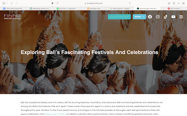
-They often represented Balinese culture as a vibrant and integral part of Indonesian culture, and it is often depicted in media in various ways, Balinese cultural festivals, such as Nyepi (the Balinese New Year), Galungan, and Kuningan, are frequently featured in media. These festivals are known for their elaborate ceremonies, processions, and traditional performances, which are showcased in television programs, documentaries, and news coverage.


These are some of the example of Balinese culture being represented in media where it implies to representation theory by Stuart Hall, where it will helps the culture gain recognition in media.


Thursday, October 5, 2023

Magazine Research

 Here is the research for my magazine


A magazine is a publication that typically consists a collection of articles, photograph or other content of variety topics. Magazine play an important role on providing in-depth information and entertainment to their readers, they serve as source of news, inspiration, and education, and they often reflect and shape popular culture.

The placement of a magazine on a store shelf or in a display rack can have a significant impact on its visibility, accessibility, and sales. Retailers and publishers work together to ensure that magazines are positioned in a way that maximizes visibility and meets the needs and interests of their target audience.


First Magazine: 

Harvard Business Review, Reskilling the age of AI, September 2023.


Harvard Business Review

HBR.ORG


Harvard Business review (HBR) is a general management magazine published by Harvard Business Publishing, a not-for-profit, independent corporation that is an affiliate of Harvard Business School.


Genre: Education

Demographic  
Age: The primary audience for the "Harvard Business Review" magazine is likely to be adults aged 25 and above. It caters to professionals, managers, and executives who are typically in the workforce or pursuing advanced education. 
Gender:The audience is likely to be diverse, with both men and women, although historically, business literature has often had a larger male readership.
Location:The magazine has a global readership, with subscribers and readers from various countries. It's not limited to a specific geographic location.
Ethnicity:The magazine's readership is likely diverse, comprising professionals from various ethnic backgrounds.
Income: Subscribers and readers of "Harvard Business Review" are likely to have higher incomes, given the professional and managerial focus of the content. They are often decision-makers and leaders in their respective fields.
Star Appeal:The magazine may feature articles and interviews with influential business leaders and academics, which can be appealing to those interested in business thought leadership, such as politicians, a group leader, or entrepreneur

Psychographic
Hobbies:The audience is likely to have hobbies related to personal and professional development, including reading, networking, and attending conferences.
Interests:The core interests revolve around business strategy, leadership, management, and staying up-to-date with the latest trends in the business world.
Lifestyle:Readers of "Harvard Business Review" likely lead a busy, professional lifestyle. They may be interested in work-life balance and career advancement.
Spending Habits: This audience is more likely to invest in educational resources, professional development, and books or publications related to their field. 


Uses & Gratification

                     Readers of the "Harvard Business Review" and "Reskilling in the Age of AI" magazine are likely seeking: 

- Information

          -Proffesional development 

          -Networking and inspiration.

 Magazine analysis

Masthead: Harvard Business review, placed on the top of the page in the area that will be looked first by the audience to attract its target audience, prominently displays the magazine's title and logo, where it is essential for branding and logo, masthead also be accompanied by a stylized design. The masthead is an important element for readers because it provides them with an understanding of the magazine's identity, 


Typography, the typography and the positioning of the text is placed on the top of the magazine which is placed in the left third and the size of the text is big and bold, to engage audience attention so they can see the text clearly.


Image: The image that has been selected for the cover is a picture of a paper that is shaped like rabbits and birds, showing unique and aesthetic value and can attract the attention of the audience. The image only has a few objects and gives a minimalist impression. Moreover, it also gives a serious impression and also makes the audience wondering and have to use their imagination to know what this front image means.

language (strapline, coverlines):

The publication's name or tagline is frequently printed on straplines, which enhances the publication's branding and identification. They assist readers in quickly identifying the publication's source and theme.

 Coverlines serve to tease and highlight the main articles, They provide a glimpse of the interesting or compelling stories inside.Coverlines inform readers about the articles that may interest them. They guide readers to specific sections or stories that align with their preferences.

For example, the coverlines of the magazine is reskilling in the new age of AI, which the coverline "Reskilling in the New Age of AI" on a magazine suggests that the primary focus of the magazine's content in that particular issue is related to the topic of reskilling (learning new skills) in the context of the modern era dominated by artificial intelligence (AI)

and for the coverlines "New Approaches for Managers and Employees" on a magazine suggests that the primary focus of the magazine's content in that particular issue revolves around innovative and updated strategies, techniques, or methods that pertain to both managers and employees in various professional settings.  "New Approaches for Managers and Employees" on a magazine suggests that the primary focus of the magazine's content in that particular issue revolves around innovative and updated strategies, techniques, or methods that pertain to both managers and employees in various professional settings.


Adverts:

Advertisement that would likely to be found here is an advertisement of a luxury goods, such as cartier, ysl or many other luxury goods because the audience that this magazine engage are more likely to be a business man or people with high spending habit. also it is clear that Harvard Business Review magazine targets business professionals, so it is likely that there are advertisements for business services such as consulting, financial planning, and legal services.

Representations:

the Harvard Business Review magazine represents a valuable resource for business professionals who are looking to stay informed and up-to-date on the latest developments in their field. 


Here is the example of table of contents in Harvard Business Review "Reskilling the Age of AI"
where it it essentials as it helps readers navigate through the magazine and provides an overview of the topics covered in the issue.

The table of contents lists the articles, sections, and chapters in the magazine, along with their corresponding page numbers, making it easier for readers to find the content the audience are interested in.


Here is the example of double page taken from the magazine.

The function of a double page in a magazine is to provide a larger canvas for an article or advertisement to be displayed. A double page spread is an article or advertisement that takes up two pages and is usually the center two pages of a magazine. And it also display image and create an eye-catching and memorable reading experience to audience.


 here is example of quotes taken from magazine

Quotes can be used when the maker wants to add value to their magazine, where it adds aesthetic value and its helpful in making the text more interesting for the readers, it also can be used to explain a particular issue in the magazine.


Here is the example of drop cap taken from the magazine

Drop cap can be used when the maker want to make the text more noticeable to the reader, and it also add visual interest to the text as it avoid monotomy in the text.


Here is the example of Byline taken from the magazine

Byline is usually being used to provide the author's name or the photography of the image that is taken for the magazine, to give credibility.  Bylines are commonly placed between the headline and the text of the article.


Second Magazine:

Halle Balle Cosmopolitan Magazine, October, 2023.


 Cosmopolitan.com

Cosmopolitan is an American monthly fashion and entertainment magazine for women, first published in New York City in March 1886 as a family magazine. 


Front page further analysis:

Masthead: The cosmopolitan masthead is placed on the top of the page, the masthead is bold and recognizable one-word title that is easily identifiable, and the font used is usually big and bold making it stand out for the cover, where it engage customer's attention.

Cover lines: Coverlines are typically used to tease the content inside the magazine and entice readers to buy the issue, the coverline is effective in drawing attention to the main image and enticing readers to buy the magazine. Because the target audience is woman, particularly for those who interested in beauty, fashion, lifestyle, relationship and health. Most of the coverlines contains about love life, dating issue, fashion such as fashion trends and beauty products, where its clear that this magazine is targetting woman.

Main Image: The main image on the cover features Halle Bailey wearing a showy coat, a mohair two-piece, and patent leather boots, The image is the central focus of the cover and is the most important part of the magazine as it is relevant to the purpose and audience, The cover image features Halle Bailey wearing a green dress and standing in front of a green background Halle Bailey's pose and expression are confident and engaging, represents confidence.


Genre : Beauty and Fashion 

Demographic
Age: 16 to 30 years old, such as young adults
Gender: Is likely to be diverse, but predominantly targeted towards woman
Location: USA, but its likely to be diverse
Ethnicity: Is likely to be diverse, but since they are using halle bailey as they main cover image model, so they must be targetting a black or brown skin toned woman.
Income: People that is interested with fashion and beauty, is likely to have a high income
Star Appeal: Halle Bailey, A singer and actress, she gained her popularity because of her role as Ariel in my little mermaid (2023).

Psychographic
Hobbies:The target audience is likely to be interested in fashion, makeup, and beauty, as Cosmopolitan magazine is a beauty and fashion magazine
Interests:The target audience is likely to be interested in entertainment, social media, and current events, as these are topics that Cosmopolitan magazine covers
Lifestyle:The target audience is likely to be well-educated, enthusiastic about learning, and interested in making a change in the world, as these are traits that Cosmopolitan magazine readers are said to possess
Spending Habits: The target audience is likely to be interested in spending money on fashion and beauty products, as these are topics that Cosmopolitan magazine covers

Uses & Gratification

The magazine is talking about issue of Cosmopolitan magazine featuring Halle Bailey to stay up-to-date on the latest fashion and beauty trends, get advice on fashion and beauty, and learn about Halle Bailey's latest projects. The gratifications of the magazine include entertainment, social interaction, and personal identity, The target audience is likely to use the magazine to learn about fashion and beauty, get advice on relationships and health, and stay up-to-date on the latest celebrity news as they put these topics on the coverlines in the front page of the magazine.


Media language

The Genre coventions of beauty and fashion magazine are to include celebrity/ supermodel on the front cover of the magazine as the model of the main image, and this magazine conform that conventions. The image is likely to attract the attention of the target audience, which is predominantly female and interested in fashion, makeup, and beauty, This cover differs by using the image of Halle Bailey that represent the magazine's effort to promote a more diverse and inclusive standard of beauty, as she is a woman of color with natural hair. It implies to Steve Neale's differences and similiarities theory, where Steve Neale's representation theory is a genre theory that focuses on the repetition and difference of genres, and is useful for analyzing how genres are constructed and how audiences interpret and respond to them. And here the cosmopolitan magazine were trying something new and different, where most of the audience know that cosmopolitan is known for always using star appeal or model that is white, but this time they break the stereotype by using halle bailey as she is known as a woman of color, so this magazine is particularly targetting minority.

Representations

The magazine's main image is using halle bailey as their model for the front page of the magazine, and its using medium shot where audience can see the outfit of where she is using a stylish green coat with a knee length boots taken by medium shot, with her fierce and confident facial expression. This is building a sense of fashion stylish and confidence and representing Halle as woman of color where it breaks the stereotype of minority.  The audience is likely to be diverse an from all the world, predominantly western, where western audience will have the preferred of this that Halle Bailey is an actress, and an amazing singer and known as Ariel from the little mermaid that were released in june 2023 as it mentioned in the one of the magazine coverlines where the they use a stand out font for Halle Bailey's name 'Oh You thought Halle Bailey was done? A little mermaid was just a warm up' Where this might be interesting for the audience as it mention about the little mermaid and indirectly targetting the little mermaid audience aswell.


Industry

Cosmopolitan magazine is a monthly fashion and entertainment magazine for women, first published in New York City in March 1886 as a family magazine. It was later transformed into a literary magazine and, since 1965, has become a women's magazine. Cosmopolitan is one of the best-selling magazines and is directed mainly towards a female audience, The magazine's content includes articles discussing relationships, sex, health, careers, self-improvement, celebrities, fashion, horoscopes, and beauty.


Third magazine 

Vogue

Vogue is an American monthly fashion and lifestyle magazine that covers various topics, including haute couture fashion, beauty, culture, living, and runway

Kate Winslet Vogue magazine, october 2023

The cover photo of Winslet looking directly at the camera also conveys a sense of confidence and fearlessness. Overall, the front page of the magazine presents Kate Winslet as a strong and empowered woman who is unafraid to speak her mind and take on challenging roles. And its mainly targeted towards woman, as it using a woman star appeal and a fun and playful colour, and the coverlines that mentions about skincare and fashion issue.


Double page, Where it can be seen, the star appeal which is Kate Winslet where she is the main highlight of this image where she represents confidence as it portrayed from her facial expression, fierce, brave and the suit that she wear breaks the stereotype of woman clothing, where it mentioned in the front page. A double page function is to create two connection of visual between pages, it also provides a larger canvas where as we can see, it provides more object where its being taken with medium-long shot.


Table of contents, to provide readers with an overview of the topics covered in the publication and to help them navigate through the content, and to navigate the audience


Fourth Magazine:

Vogue British
Vogue is an American monthly fashion and lifestyle magazine that covers various topics, including haute couture fashion, beauty, culture, living, and runway

Karlie Kloss Vogue british magazine, 2 November 2015


The Masthead is VOGUE, and its located on the top of the page with a stand out font to attract consumer's attention, also to provide a publication identity so i can be recognised by the audience.

The main coverlines is about Fashion, where they mention about the best dressed and style, where its mainly targeted towards female who has interest in fashion, or fashion lifestyle.

Other coverlines also mentiones about supermodel, fashion tips, new looks and a guide to perfect date where it mentioned there "The man every woman wants to know" Where it is clear that its targetted towards woman, particularly to adult woman who have interest about dating. Also it targetting all woman in the world but predominantly woman in British as this vogue magazine edition is located in british, where they put the location in the masthead.

The main image, featuring Karlie Kloss as their model, taken by medium shot, showing her confidence and her wearing a stylish backless top with a blue pendant jewelry creating the sense of luxury and fashion stylish.

The third left is highlighting the star appeal's name, Karlie Kloss, who is known as an actress, where it might be visible and attracting consumer 's attention where it will be put in the book shelf on the magazine store and the upper third left area is the only area that will be shown to consumer, and its an important part as it will decide whether the consumer would buy it or not.


Double page, where it provides a larger canvas and avoiding the monotomy in the magazine and provide more visual where its adding to aesthetic value of the magazine itself.


Fifth Magazine:
Vogue British, sept 2020

Vogue is an American monthly fashion and lifestyle magazine that covers various topics, including haute couture fashion, beauty, culture, living, and runway


The Masthead is Vogue where is located in the top of the magazine with a bright and bold font where its the first thing that is noticeable for the customers.

The Main coverlines brings up about fashion issue, indicates that the magazine will dominantly contains about fashion, where it is clear that this magazine is targetted towards woman.

The Main Image contains 4 models and all females where they all wear a stylish clothes taken with long shot or full body shot where all of the models dressed in the same theme, bold and black glamorous creating a sense of fierce and fearlessness, where it might attract woman with a luxury fashion taste.


Table of contents, to provide readers with an overview of the content and to help them navigate through the publication.


The double page, provide a larger page and adding aesthetic value to the magazine, where it breaks the monotomy in the magazine, in this double page, taken by medium shot, shows model from all race and ethnicity convey that this magazine is likely to be diverse and is targetting female from all ethnicity.


Sixth Magazine:
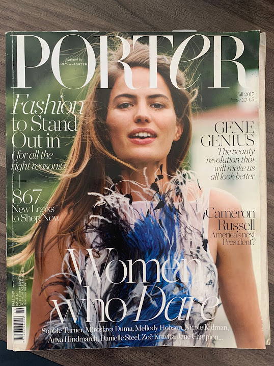
Porter
Porter magazine is a luxury fashion and lifestyle magazine created by online luxury retailer Net-a-Porter

Fall, 2017

The Masthead of this magazine is placed on the top of the cover, Porter, so it will be visible for the consumer.

The Main Coverlines mentioned about woman who date, where it indicates this magazine contains about dating issue for woman, and targetted towards woman 

On the other Coverlines, its also mentioned about fashion, beauty, and the next president for America, where it shows that it targetted towards those who located in America.

The Main Image is using a female model taken with medium shot, and a fresh and playful image where the model is smiling creating sense of purity and calmness, also the color scheme that is soft. 


The Double Page provide a larger image and connecting 2 pages together where its eye pleasing for the consumer as it adding aesthetic value to the magazine.


Self Reflection:

I found this task is hard and challenging for me as i need to do an analysis for 6 magazine total which is not a small amount of number for me, i added a lot of information and delve deep into the analysis to make sure that i didn't miss any detail, i found this task is boring but its necessary for the making of my magazine because i learned a lot through this research, i also consider to apply some of the element from the magazine ive done research on, such as the calm and cool color tone where it add values to the visual. I will consider putting this for my magazine.


Weekly progress

Here is my weekly progress for the magazine project, and also my rough plan


Week 

hhasqTerm 2

Week 

Term 3

1

(2 Oct)

Brief, Research

8

( 8 Jan)

Development

2

Research

9

Shoot

3

Research

10

Shoot, Self Reflection

4

Proposal 

11

Post Production

5

Development

12

Post Production

6

Development

13

(12 Feb)

Deadline (Monday 12th February)

7

Development

14


Week 1:

My Teacher introduced us to the magazine component, like masthead, strapline, coverline and i think its interesting because its sounds really fun because i am going to do my magazine project together with my friend, Sharon. Also we do a front cover analysis and identify the function of every component.

To do: 
-Discuss with my friend sharon about our magazine project together because we weill be working in a one group together
-We have to bring a magazine for our magazine project.


Week 2:


This week we do our magazine analysis and research, to find the meaning of every magazine component and terminology, we also learn about Representations theory by Stuart Hall where media create meaning, and he argued that there is no fixed meaning in this world which i can understand after discussing with my partner. I am capable to do the homework given and finished it on time, which is the magazine front cover analysis.

To do:
-I need to finish the magazine research of 2 detailed analysis and 4 other magazine analysis
-I need to discuss more about my magazine project with my teammate, Sharon because we will be working together in this project.


Week 3:

This week we do the further magazine research and we learn more about representation theory invested by Stuart Hall and how to apply it in real life.

Also i decided to change the font of my weekly progress so it is easier to read.

+= i understand the definition of stuart hall theory
-= i had a hard time doing my magazine analysis because i am confused about how to do the front page analysis in detail, but after talking with my teacher, i try to do more research and find more preferences for my magazine research.

Problems: 
- This week was so challenging because we have so many works to do and my teacher just gave me another work to finish,which is the statement of intent.

- I have a hard time doing the further magazine analysis.

Solutions:

-I have to spare some time to finish my homework

-I need to talk to my teacher about how to do a further magazine analysis

To do :
-Took a picture of magazine stall in a book store
-Finish 2 detailed and 4 full magazine work.
- Finish the statement of intent before next friday.


Week 4:

This week i completed the magazine research and statement of intent for my magazine, i also start doing my magazine development where i find it a bit tricky because i need to do a lot of research and have to find a lot of references to complete the magazine development, but my teacher told me that i can change some parts in my magazine development if i change my mind someday.

+: we learned further about Steve Neale representation theory, where he theorised that difference is needed in media to differentiate one and another. Neale states that genres all contain instances of repetition and difference, and difference is essential to the economy of the genre
 
-: I am not satisfied with my classwork scores, where i was assigned to write about Steave Neale representation theory, after talking with my teacher i know my mistakes, i didnt really mention the target audience, i will learn from my mistakes and improve myself so i can do better next time.

To Do:
-Find a references for my magazine
-Complete my magazine decelopment


Week 5:

In week five, we did media theories which help us understand more about the terms of media. During this week we also did a review of the key concepts of media studies by making a mind map/poster in a group, then we shared the information to our groups through gallery walk. 

-: The problem that faced this week was, i was absent on a meeting so i have to do catch up and i have lots of assignments to complete

+: I was able to finish all the assignments and complete it ontime, i also do a make up test of media because i was absent. 

To Do:
-Complete my blogpost
-Do the double page analysis

Week 6:

This week i completed my unit test and double page anaylisis, i also started doing my 1st draft of my magazine doublepage, where i found it chill and okay, but i still need to do a lot of research for my double page, We also talked about new media and traditional media theory, and i can understand about the theory easily since my teacher communicate it well.

+; i am able to finish my unit test, i finished doing my double page analysis and i can manage my time really well to finish all the classwork given.

-: I am a bit confused while doing the first draft of my magazine since i need to do a lot of research and i have to think about the name of the author in my double page

To Do:
-Finish my empty blogpost
-Continue to do research and finish my 1st draft of double page article where it consist 700 words.


Week 7:


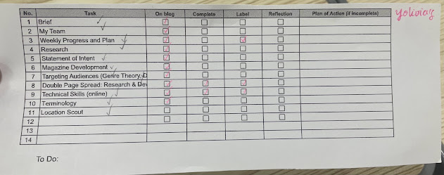
Our teacher gave us this table to checklist every work that we already do so it helps us to determine which work that we still have to do, and overall i already have all the blog in my post, but i haven't completed it yet, so i will working on it in this week, because this is the last week before we do the semestral exam.

My teacher also give us a task to do during term break, where we have to find a location for the photography that might be needed for our magazine. We also need to complete the Location Scout blog next term.


Semester 2


Week 1:

This week, we learned about industry in Media, such as production, distribution and exhibition, and we were assigned into a group to discuss about production. And after that we change our blog's theme because my teacher said its easier for cambridge examiner to mark our work. So i changed the theme with my teacher's help.

+: I understand the material that my teacher discuss on the first day, about production, distribution and exhibition because it was easy to understand.

-: -

To deo: Finish Location scout blogpost, and discuss with my partner to take a photo for out magazine project.

Week 2:

This week, we do some magazine practice, my teacher made a google draw where we can arrange the masthead, picture, coverlines, barcode and etc to learn how to make a good magazine, which help me so much to learn how to make a good magazine arrangement, we also took a picture of a model for our magazine, in class environment just to practice taking picture so that we know what to do.

-: Its hard to find a good photostudio or a location for our photoshoot
solution: we found a good photoshoot place in Bali that is not really far from my house but its far from my partner's house.

+: good understanding of how a good magazine cover being made

to do: Take a picture for the main cover with my partner sharon, at 27th january, we're planning to go to a photostudio and take picture of ourselves as the model cover magazine.


Week 3:

This week we learn about how media produce content or news, based on the latest, recent topic or based on certain purpose of them making it to influence audience where it can benefit the media company, and from this lesson i become more aware and smarter everytime i consume media. We also continue our magazine development post, and design the layout, masthead, coverlines and any possible design for my magazine before i finalize it. I also decided to not continue working in team with my friend, Sharon, because we find it really hard because we have so many ideas and we can't combine it all together. So starting from this week, i will be working independently, but we will still take the main cover picture together, so me and Sharon as the model.

-: Its hard to find a time to do the photoshoot because starting this week we already have so many project and unit test.

+: I discussed with my group about ways to consume media and i undertsand all the theory.

to do: -finish magazine development and location scout
          -do a photoshoot for main cover magazine with my friend Sharon.

Week 4: ⋅˚₊‧ ୨୧ ‧₊˚ ⋅

This week we do exam practice in the collaborative notes, and we start to do our critical self reflection of our magazine, where we do the critical self reflection for an hour

-: I feel confused where to start my critical self reflection, but i copy the last version of my critical self reflection so i can stay on track.
+: i already did the critical self reflection until question one, where im proud of myself because thats a good progress there where i usually procrasinate to finish it, but i learned my lesson to do it slowly, either at free time or class.

Week 5:⋆𐙚₊˚⊹ ᡣ𐭩

This week, i did my unit test and im not satisfied with it, i didnt do my best because of the limited time and because i was too nervous. We also continue making our front page cover for the magazine and i got a lot of feedback from my teacher, where it helps me a lot. 

-: -bad performance on unit test

to do: -finish front cover page
          -finish contents
          -finish double page
          -finish critical self reflection
          -finish the whole magazine
          -finish magazine development

Week 6 𐙚₊˚⊹ ᡣ𐭩

This week, there's so many disruption so i was not able to come to class because there's ceremony, election day and other ceremony. Which is a problem because i will have to do the work alone at home and i can't ask for my teacher feedback or opinion. But i already have a progress for the cover page, contents and article, i wanted to change the article because i changed my mind and want to write about feminine empowerment through fashion rather than only focusing on fashion, so i will need more time to change the whole article and manage to finish all the magazine pages.

(-) = class skipped because of the ceremony

To do= -Finish the article
            - Finish double page spread
            - Finish contents page
            - Finalize cover page.
Week 7 

This week we had full project lesson where i actively ask my teacher for feedback and it helps a lot, i became understand of how do make an actual good magazine. Because i never knew that it was actually that hard and i need to put a lot of effort in detailing and taking care of small details like the accuracy of the coloumns, the guiding line which helps me a lot to arrange the whole magazine contents. But i really find this project hard and stressing.

(-) = lack of time management

to do: -Finish contents page and double page.
          -Finish the whole magazine and input it in the online flip book
          -Finihs self critical reflection

Week 8


This week we had full project lesson because the deadline of the magazine project is on thursday this week and i rushed to finish everything before thursday which stress me so much. Although i already do the magazine project every single day which means there is a lot of progress, but i still need time to finish the whole thing. This also affected by the full schedule of mine where i have 1 quiz 2 test and this media project on thursday which stress me that much and make me so overwhelmed. But i find this magazine project really hard because i have to put so much attention on small detail like i have to make sure that all the fonts that i am using on my magazine page are the same where i thought it wasnt really important because its not visible and i thought it looks the same. But i learned a lot of things from this magazine making and the research, especially from my teacher's feedback where i improved a lot on doing the layout of my magazine and learn about the composition of each page where its not good to have a lot of blank space in the middle so put the object in the middle and let the blank space be on the upper or the below page.

( - ) = full and hectic schedule this week, can't really focus on finishing media.

solution: spend one sleepless night before deadline to finish self critical reflection and every reflection on every blogpost.

Final magazine result

  So here is the final result of my magazine Here is the link = https://online.flippingbook.com/view/520589632/ (Copy the link from this blo...